![]()
2023
Stooper App
Role:
UI/UX, Research, Prototyping, Usability Testing,
Visual Design, Enthonographic research
Investigated market trends and consumer relationship to second-hand furniture to design a gamified mobile experience that allows New York City residents to discover and rescue abandoned objects on the streets. This platform aims to turn New York City into a playground for ‘stooping’.
Collaborator:
Krithi Nalla, UX Researcher
CONTEXT
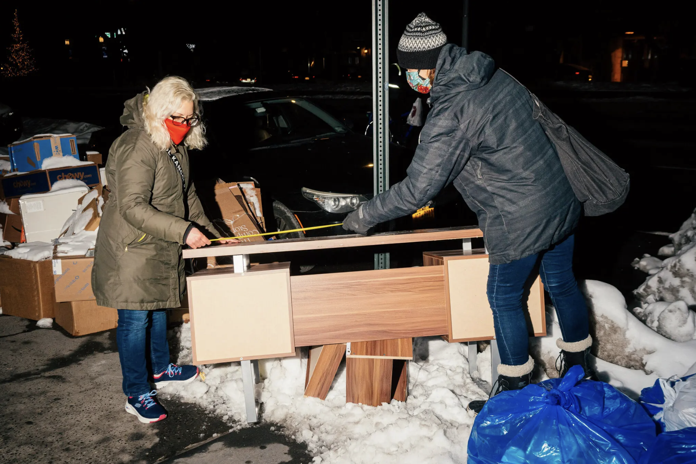
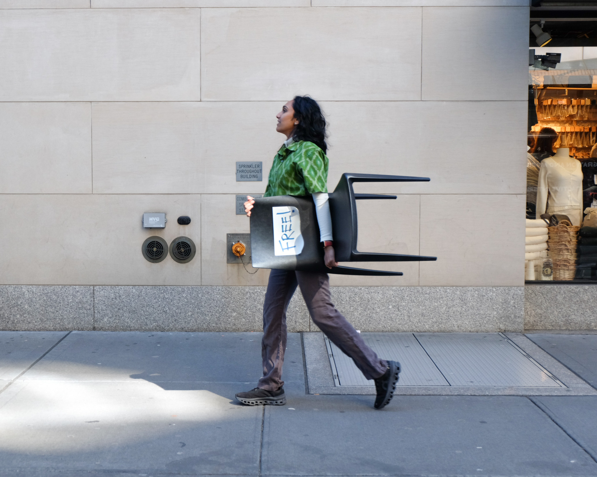
"Stooping" refers to the act of rescuing a desirable abandoned object from the street. This culture is popular among young adults in New York City. Currently, it is largely dependent on word of mouth and random chance.
![]()
CONTEXT
"Stooping" refers to the act of rescuing a desirable abandoned object from the street. This culture is popular among young adults in New York City. Currently, it is largely dependent on word of mouth and random chance.
"Stooping" refers to the act of rescuing a desirable abandoned object from the street. This culture is popular among young adults in New York City. Currently, it is largely dependent on word of mouth and random chance.
PROBLEM
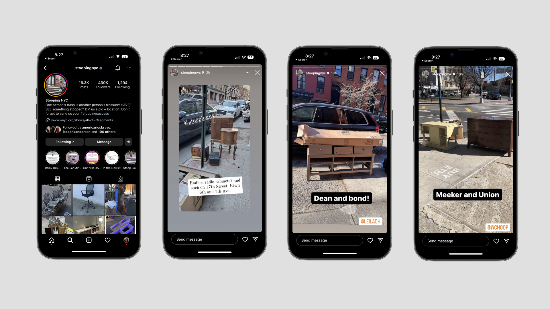
Generous Instagram pages and second-hand resale sites have long helped stooping communities. But these are not tailored specifically for the unique sub-culture. Perhaps a dedicated system could be developed to help improve the success rate of finding items.
PROJECT GOALS
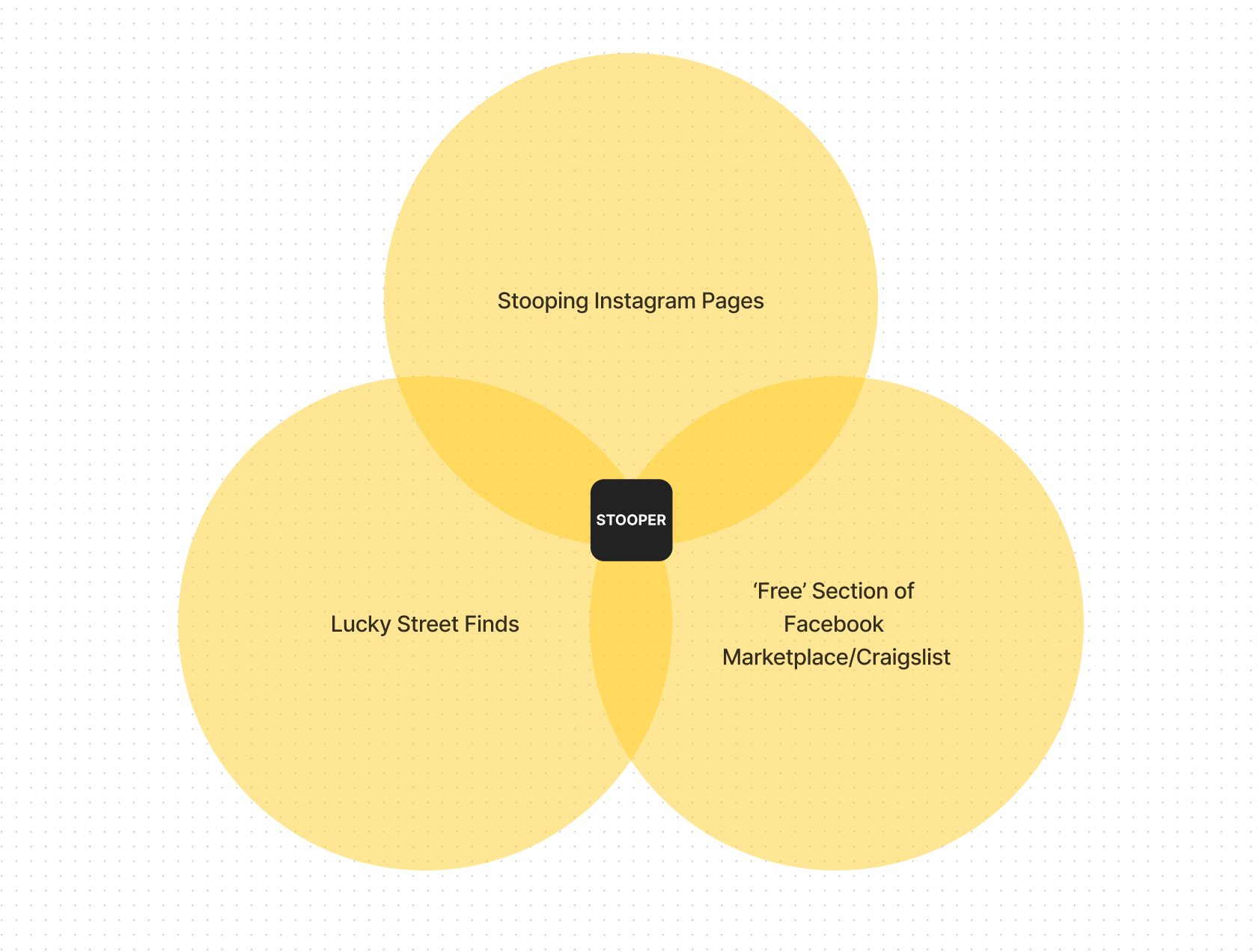
1. Introducing Stooper, a community-based app designed by and for stoopers.
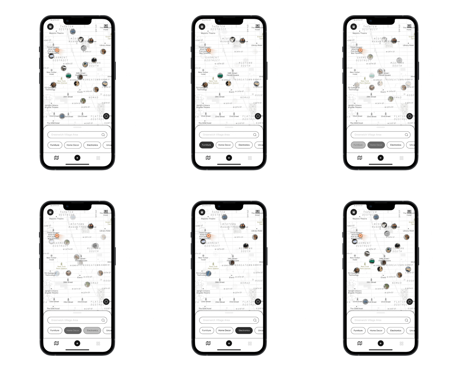
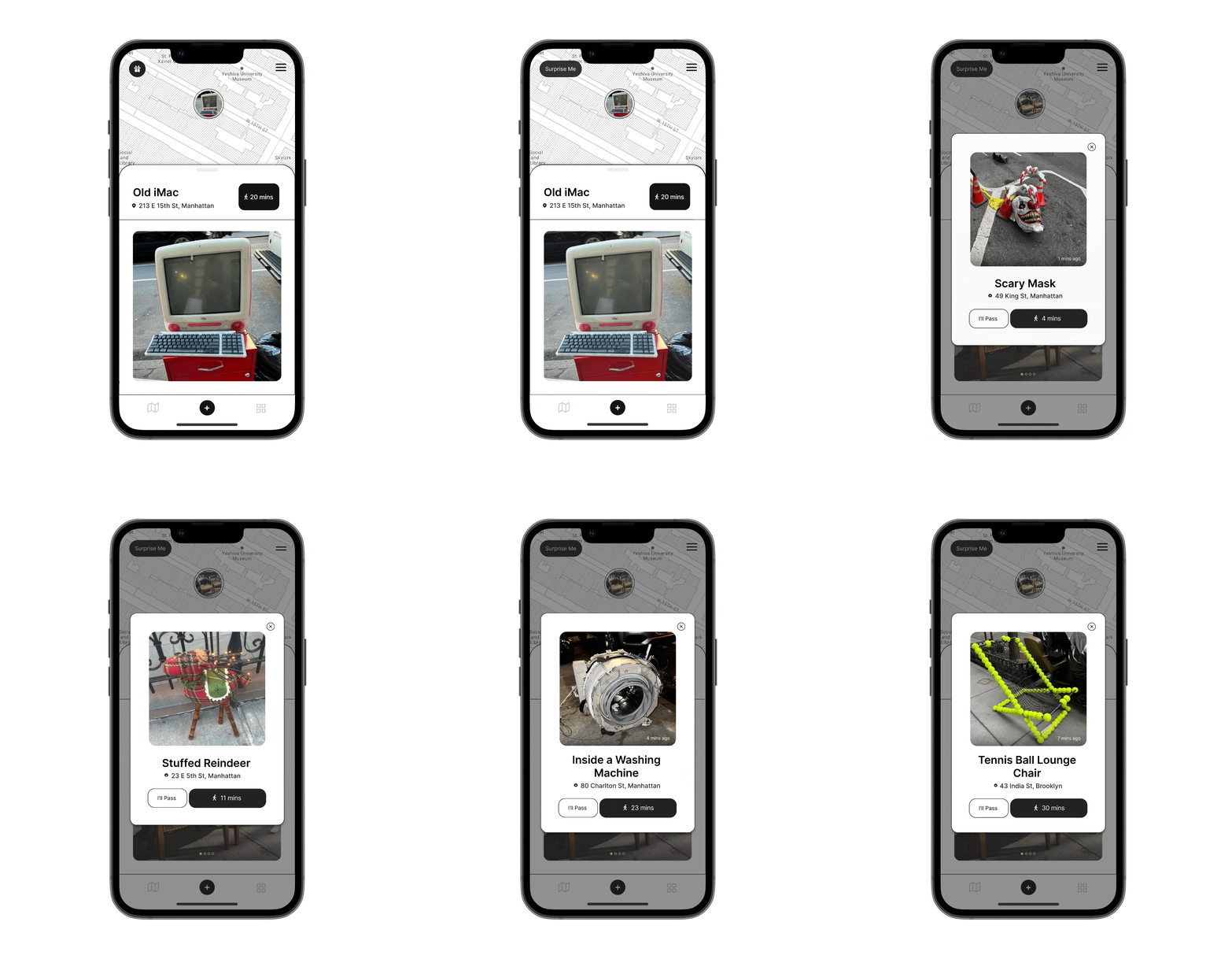
2. It provides live updates and an interactive map-based feed that displays all the interesting finds nearby.
3. With real-time information on the availability and location of objects on the street, Stooper makes it easy for you to decide where to go.
![]()
PROJECT GOALS
1. Introducing Stooper, a community-based app designed by and for stoopers.
2. It provides live updates and an interactive map-based feed that displays all the interesting finds nearby.
3. With real-time information on the availability and location of objects on the street, Stooper makes it easy for you to decide where to go.
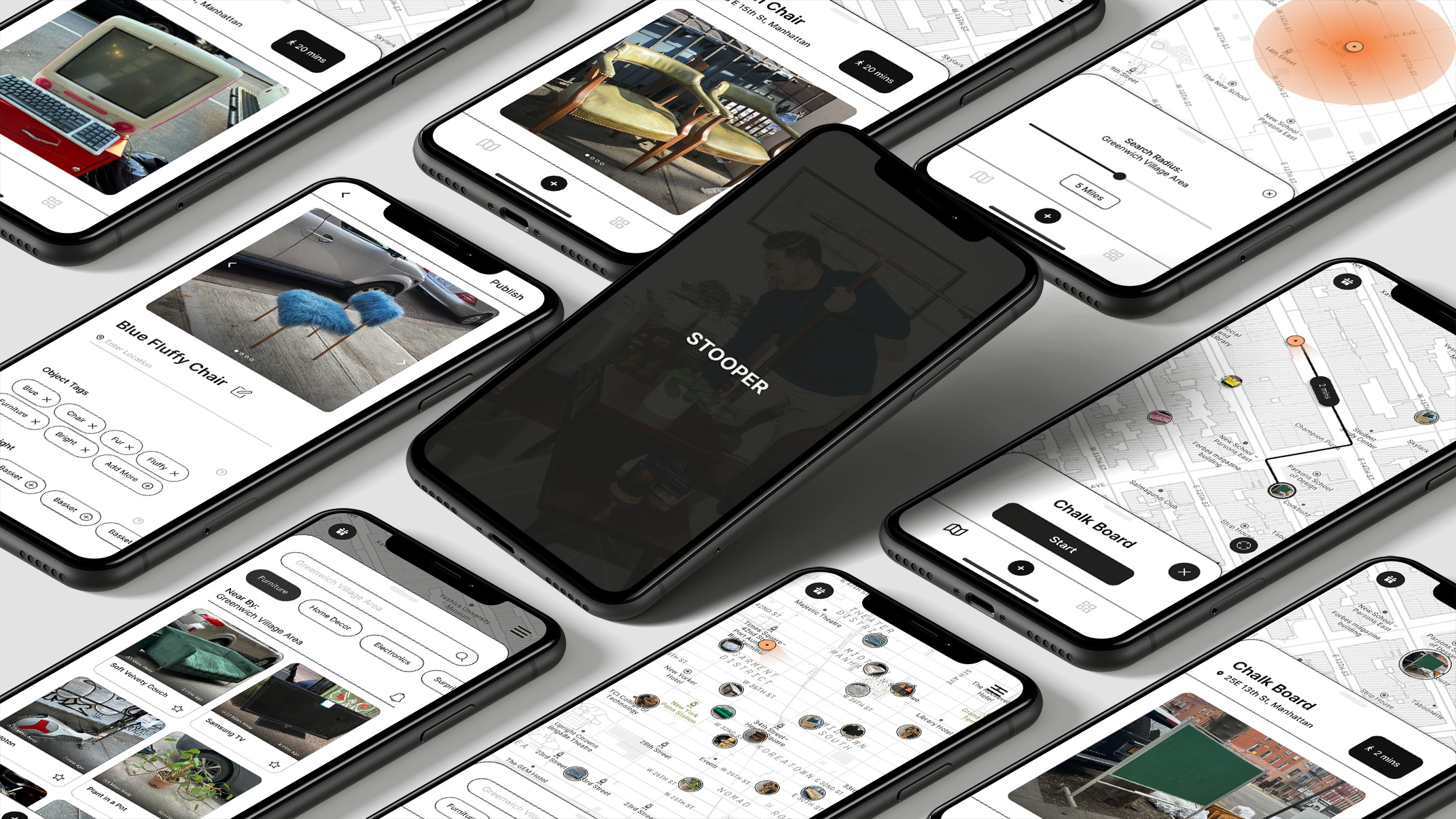
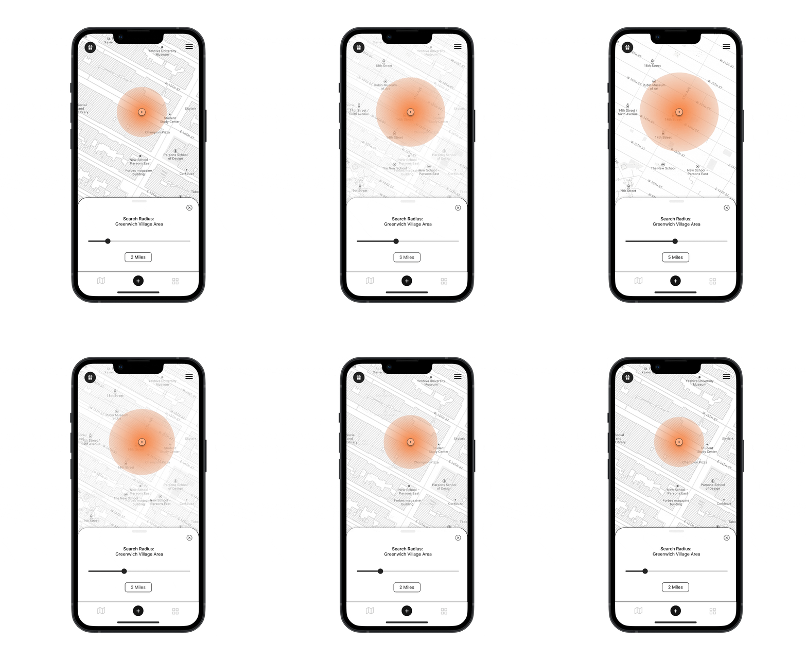
FEATURE HIGHLIGHT 1

Fig 1: Map-Based Discovery Experience
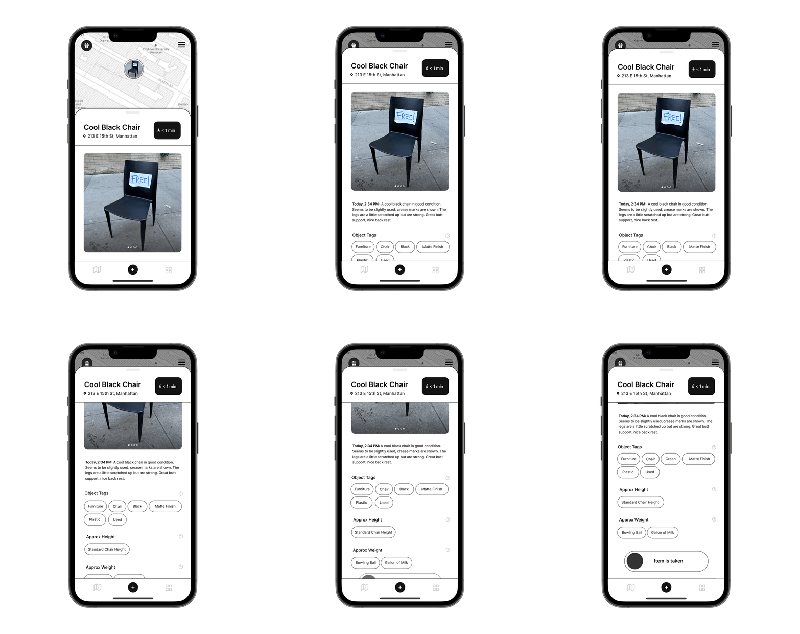
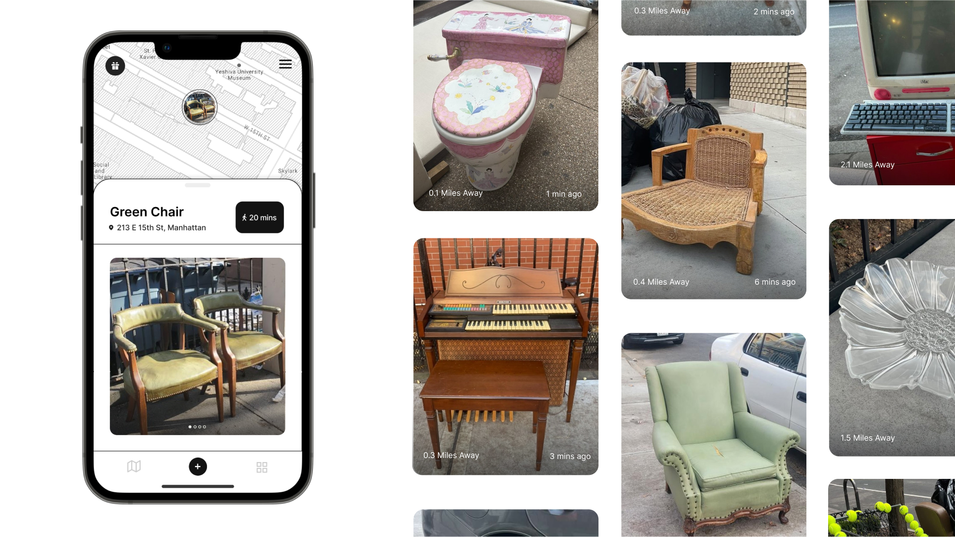
FEATURE HIGHLIGHT 2
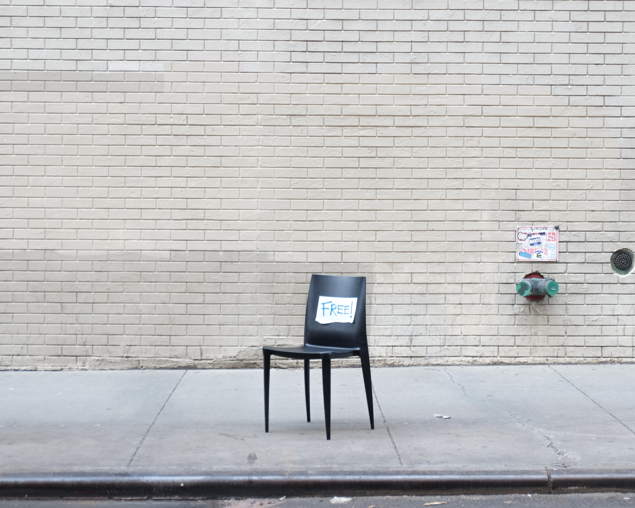
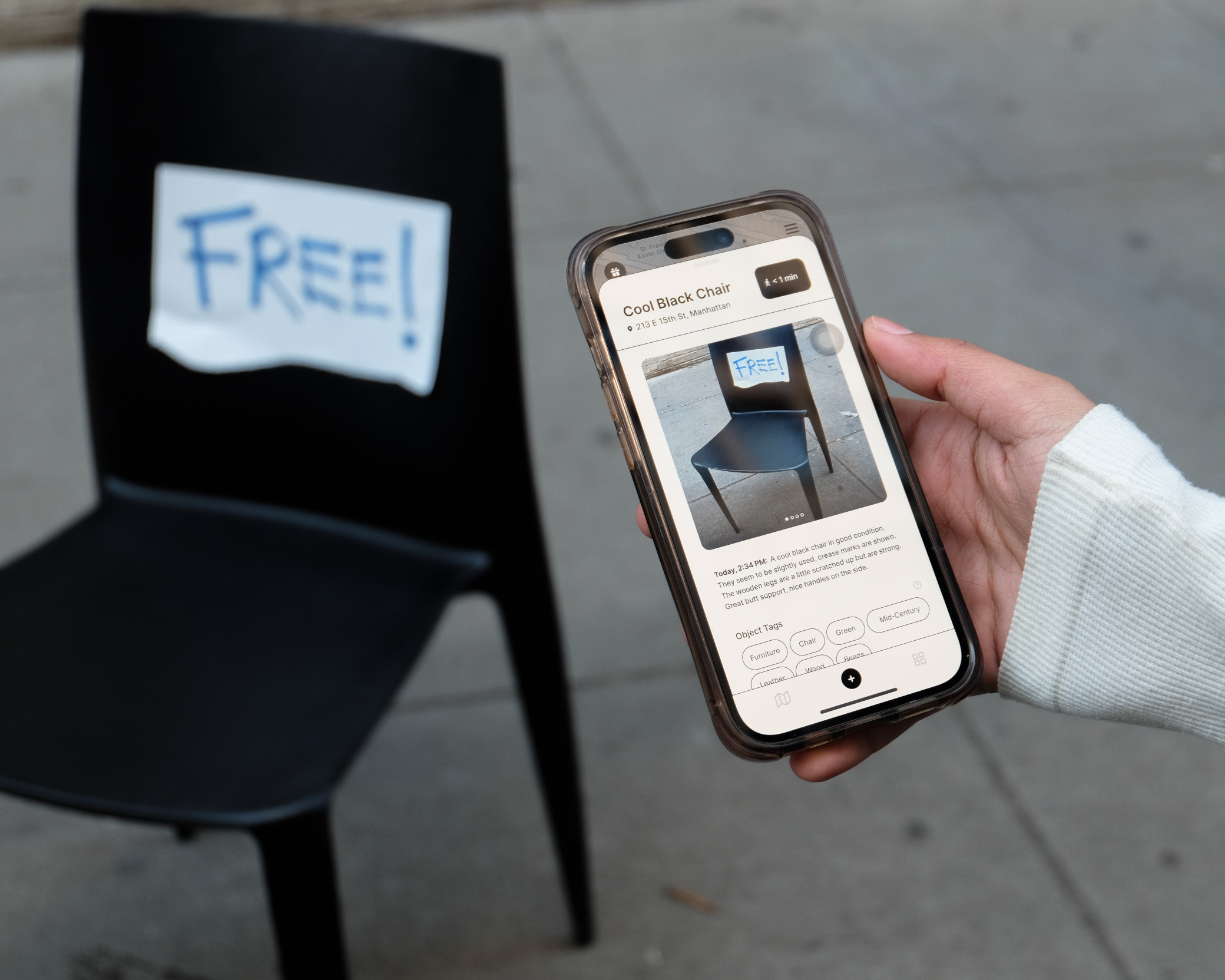
Fig 2: Relevant Object Information
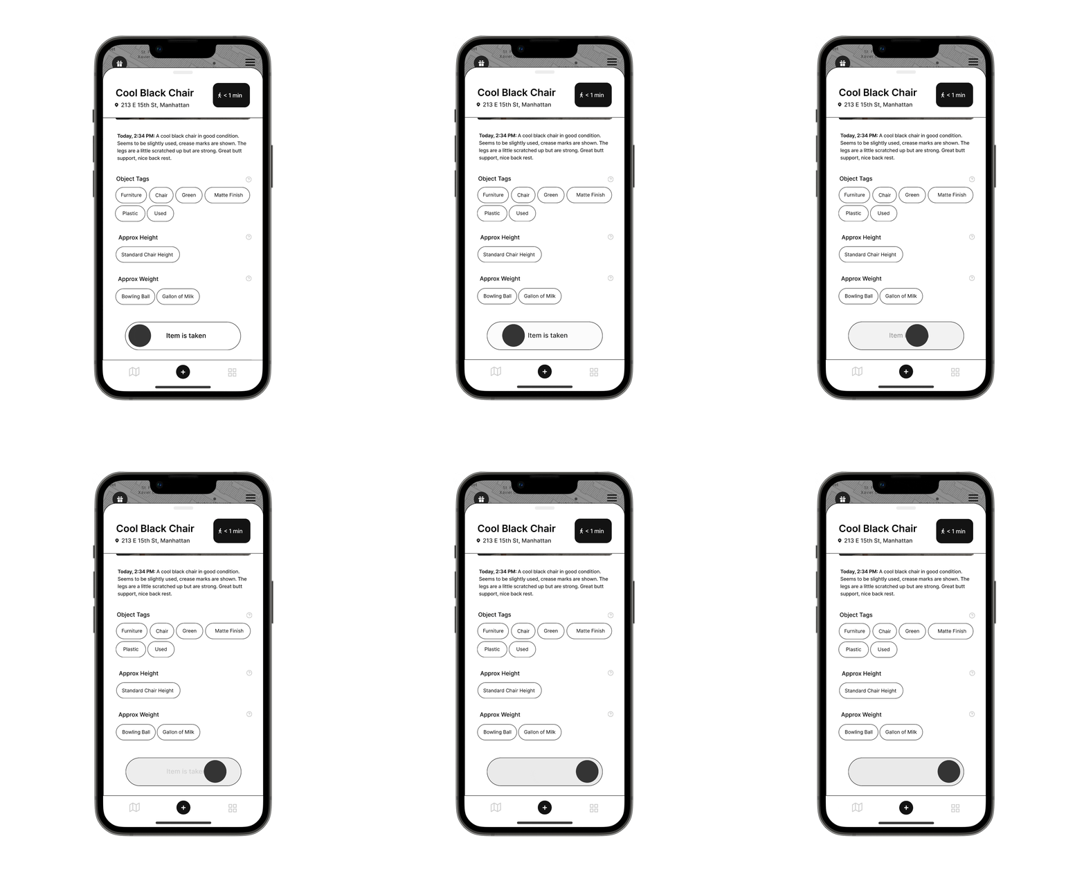
FEATURE HIGHLIGHT 3
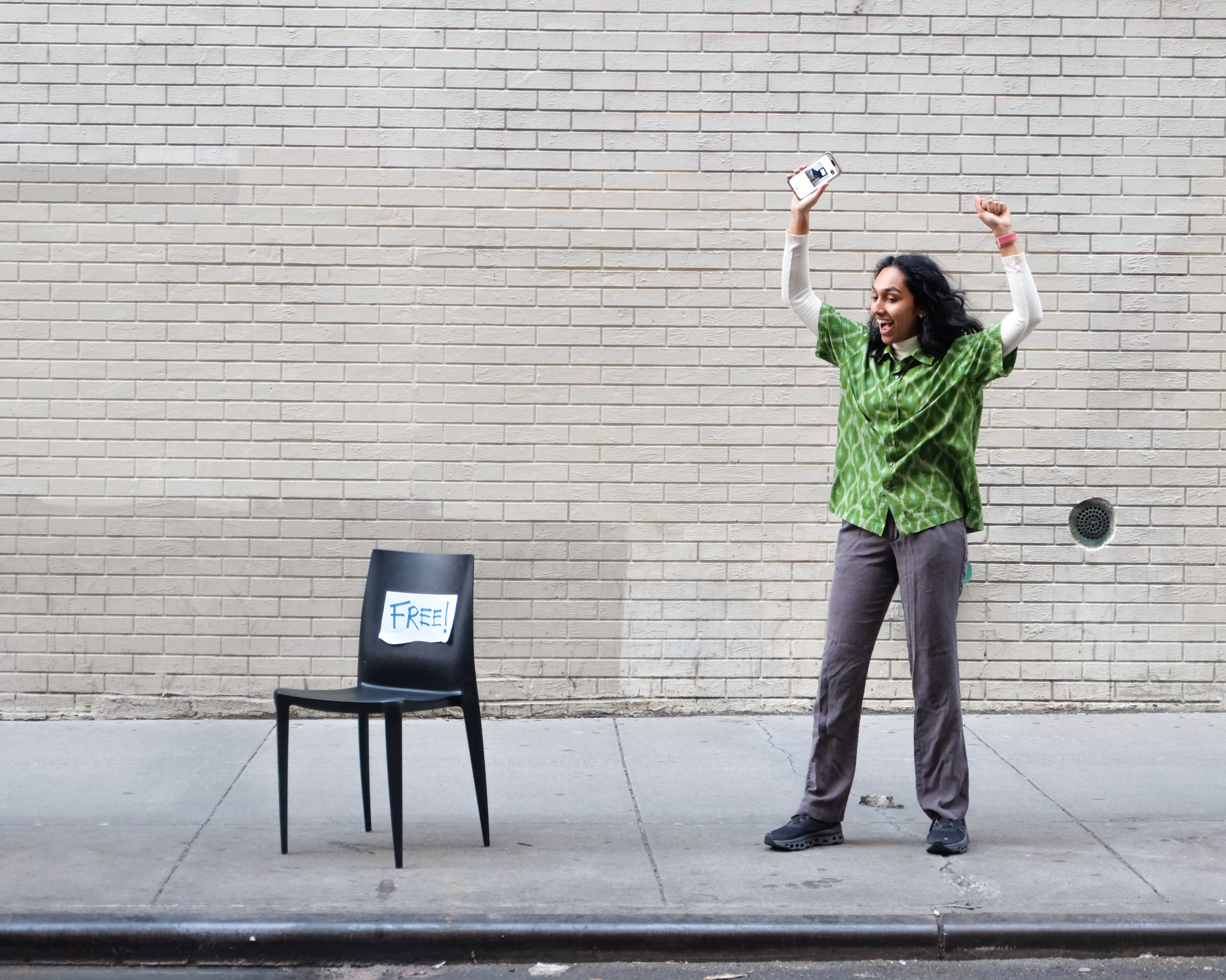
Fig 3: Report As Taken
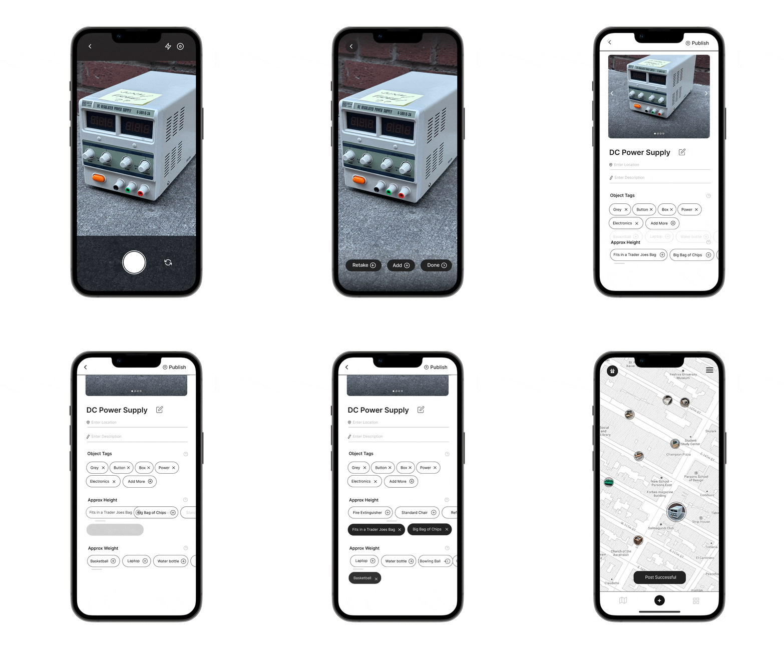
FEATURE HIGHLIGHT 4
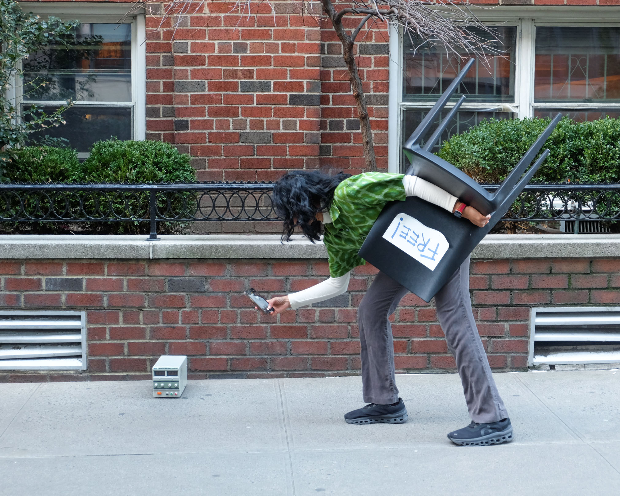
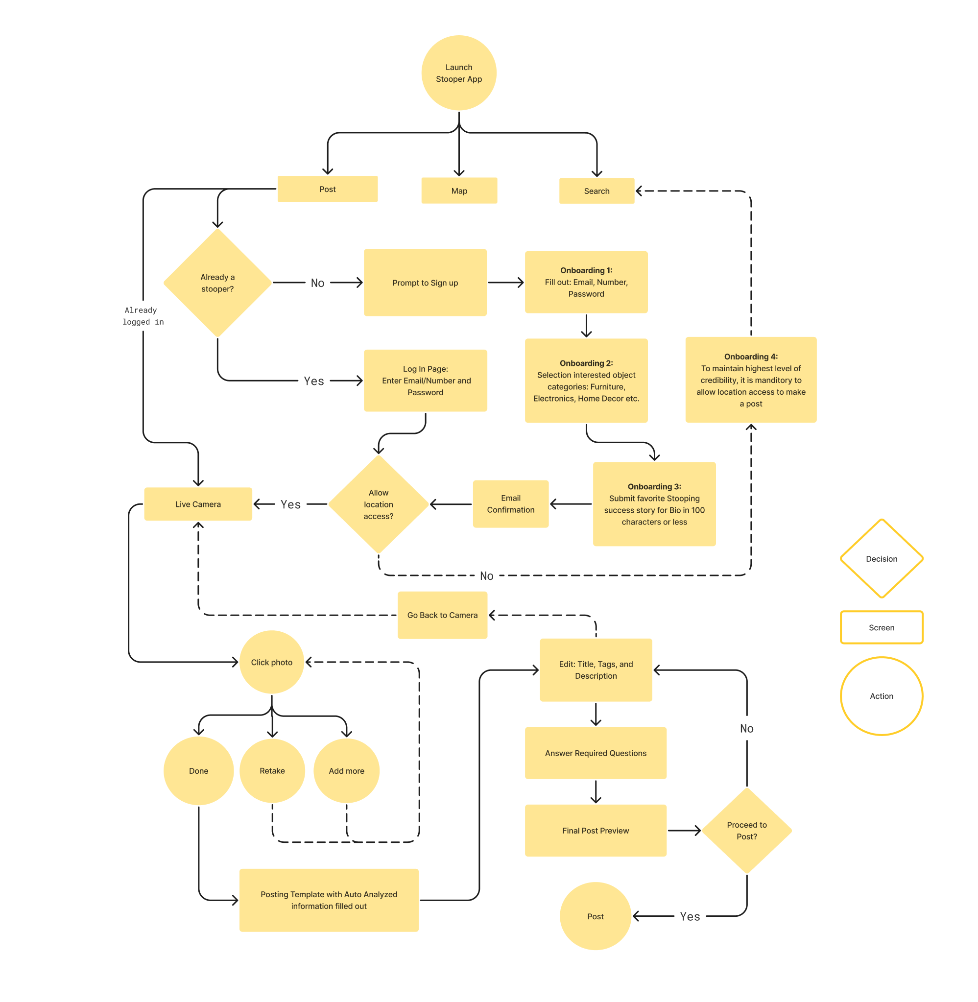
Fig 4: AI Assited Posting Experience
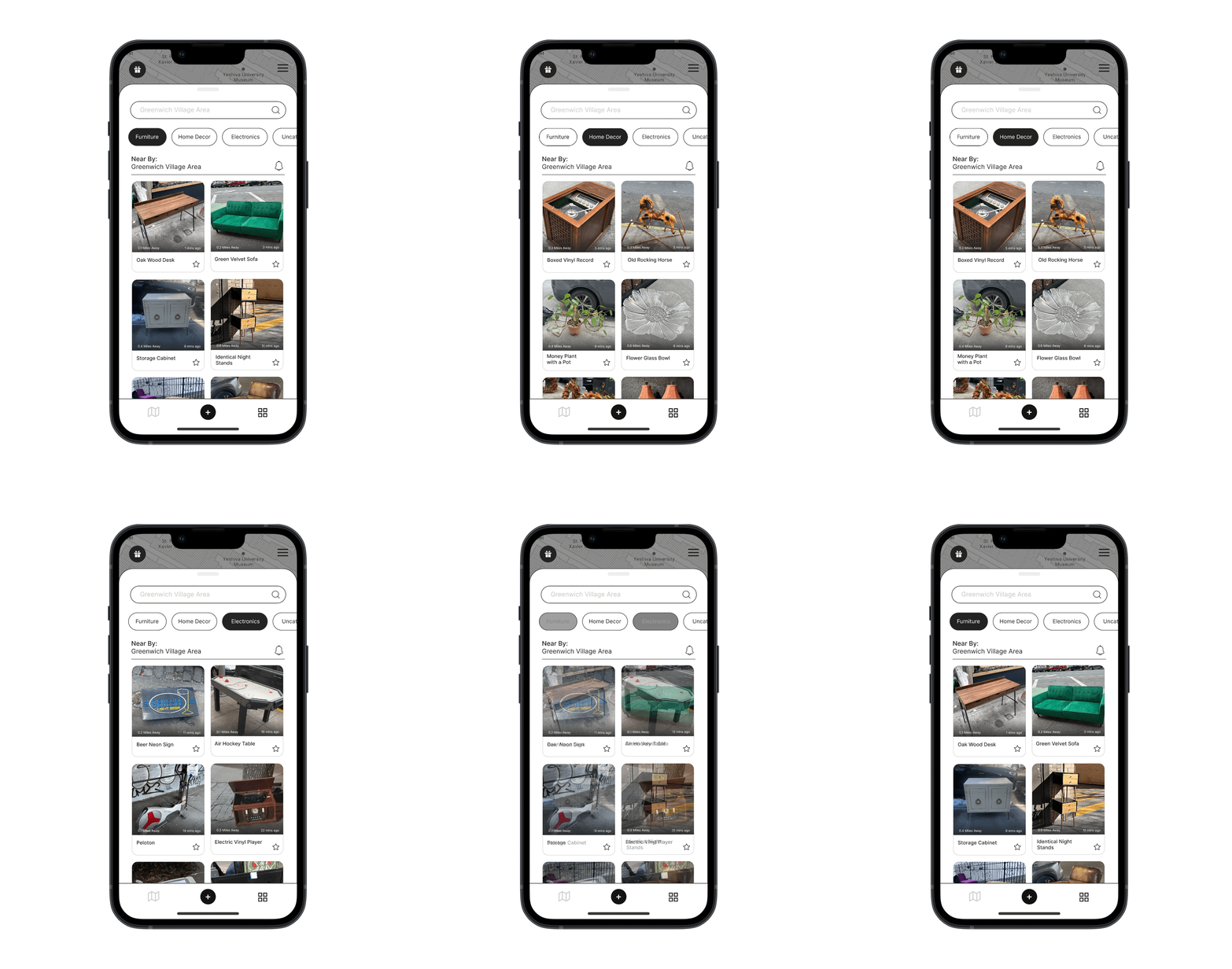
ADDITIONAL FEATURES
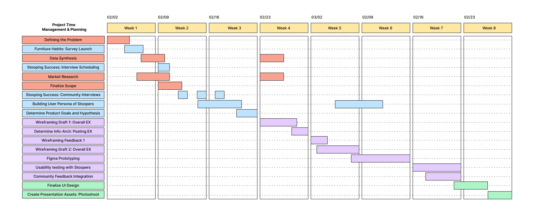
RESEARCH ROADMAP
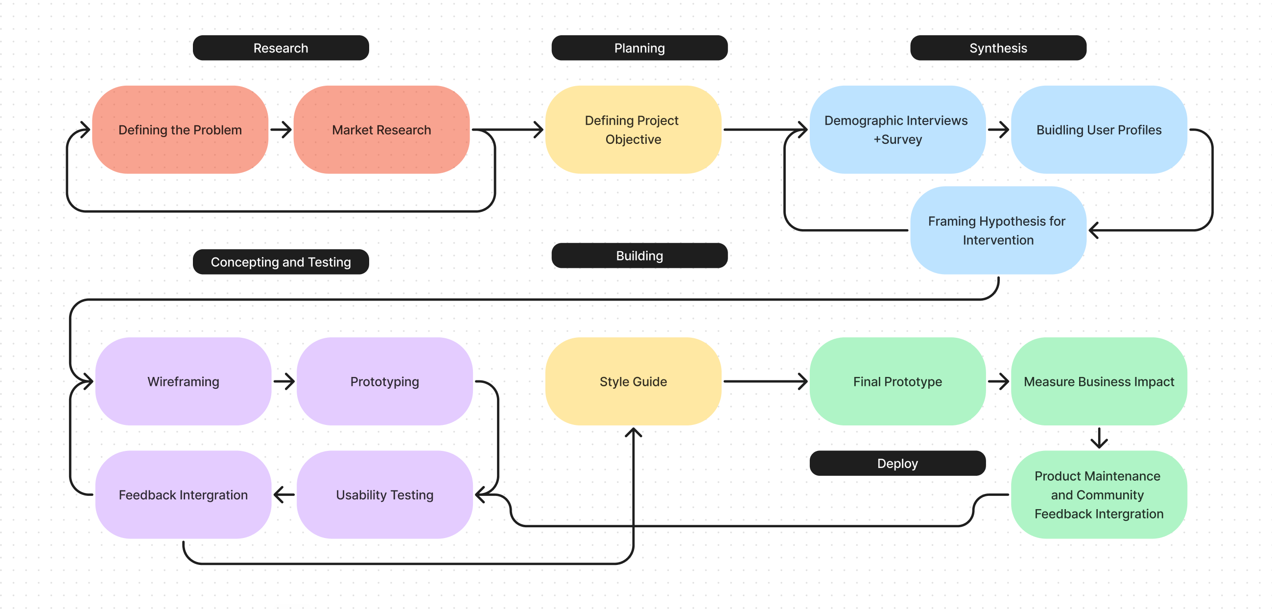
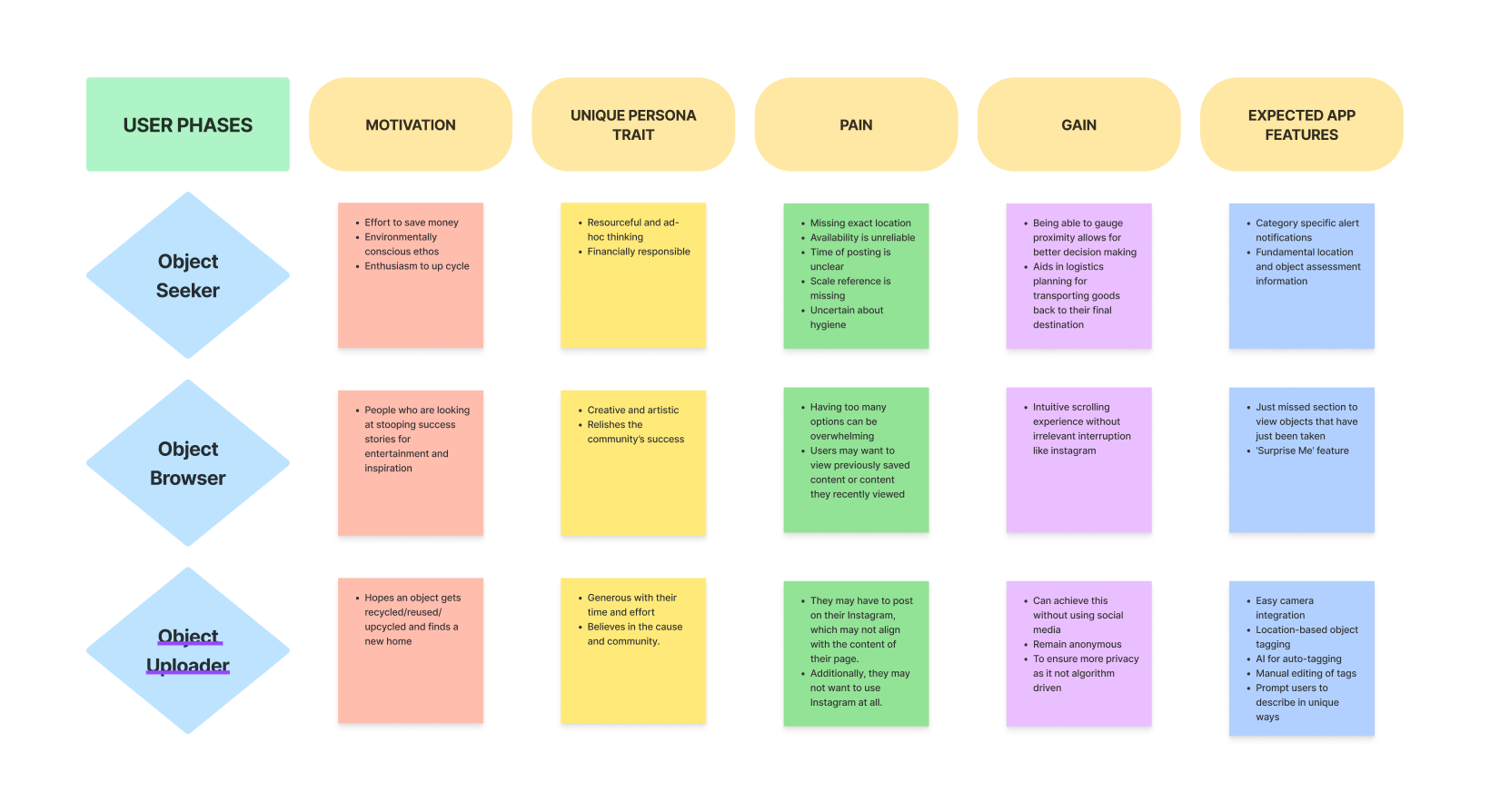
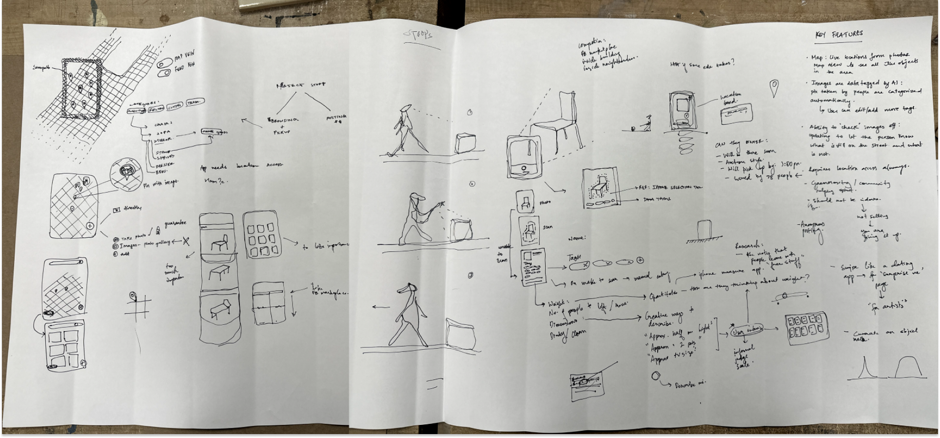
Acknowledging that the research method was not linear but rather cyclical, it was important to keep the community involved from the beginning. Designing an experience that kept the community's values close to its core was an good challenge.
MARKET ANALYSIS
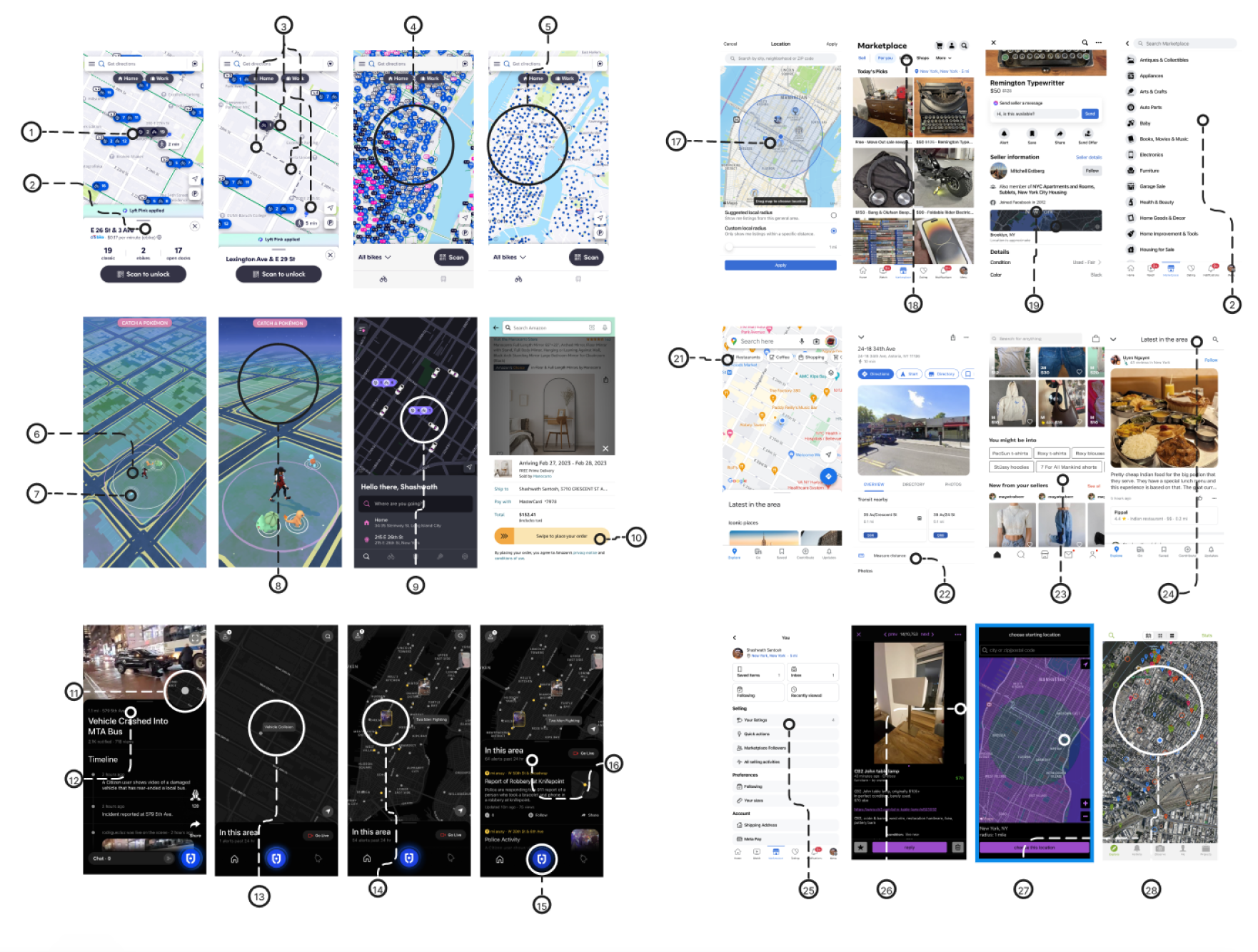
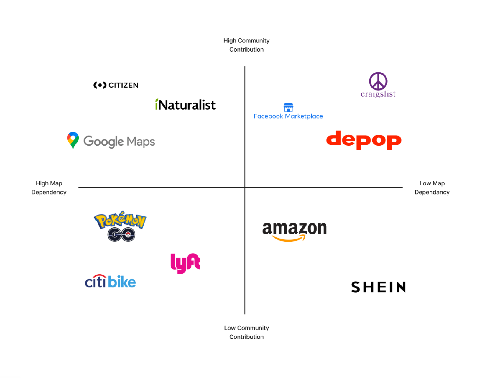
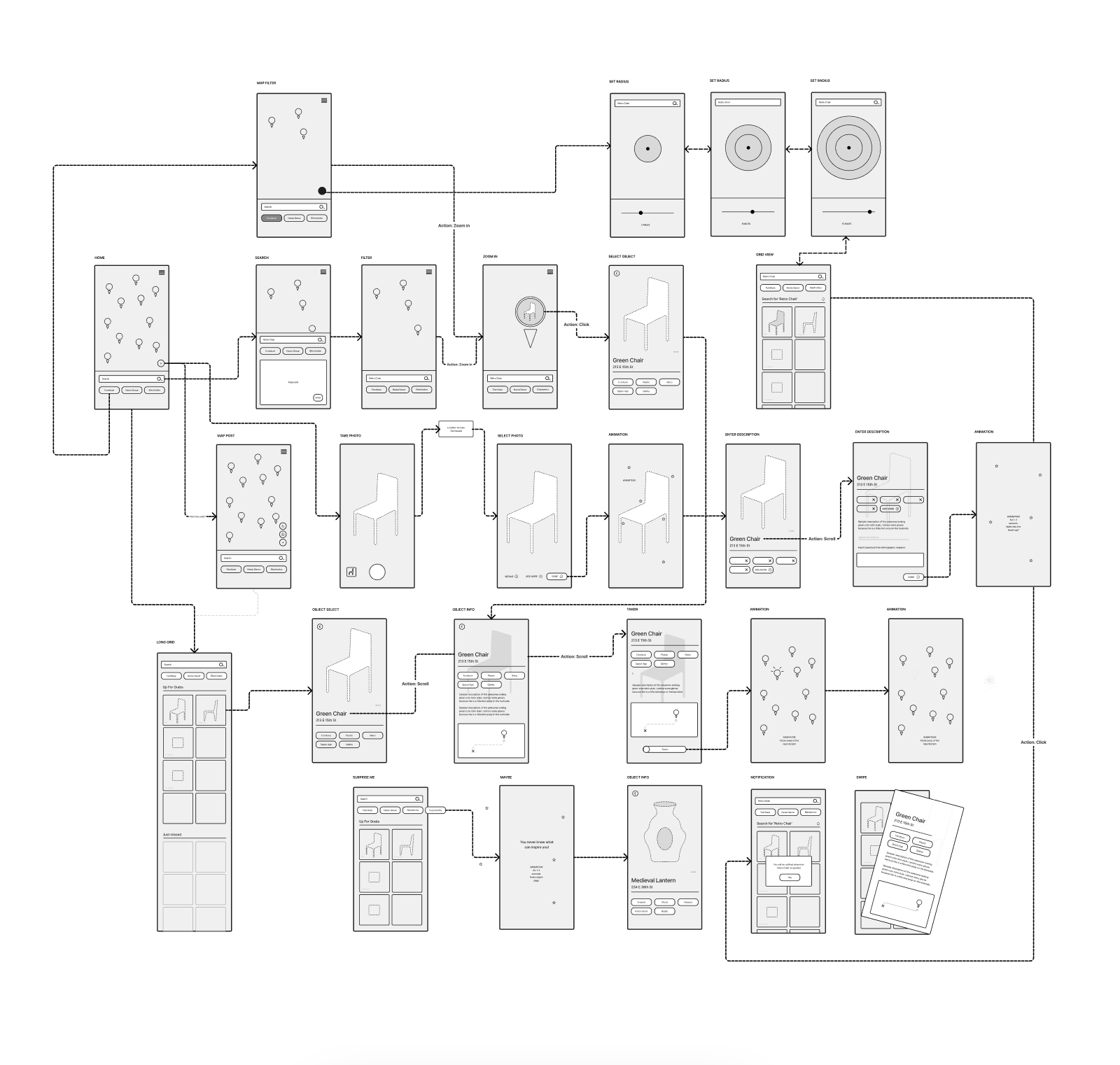
Fundamentally, Stooper is an experience based on maps. We analyzed a variety of app interfaces and user flows that involve navigation and geography.
By studying existing products and their level of community contribution, we learned which familiar features could be adapted to the stooping experience.
MAIN USER INSIGHTS
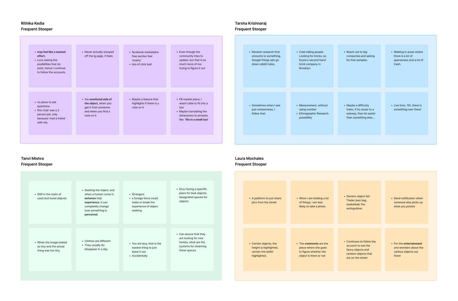
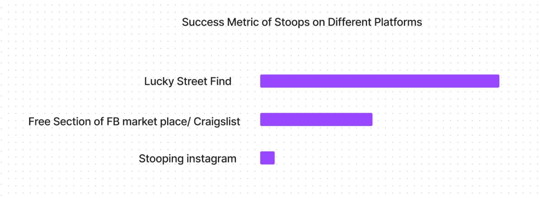
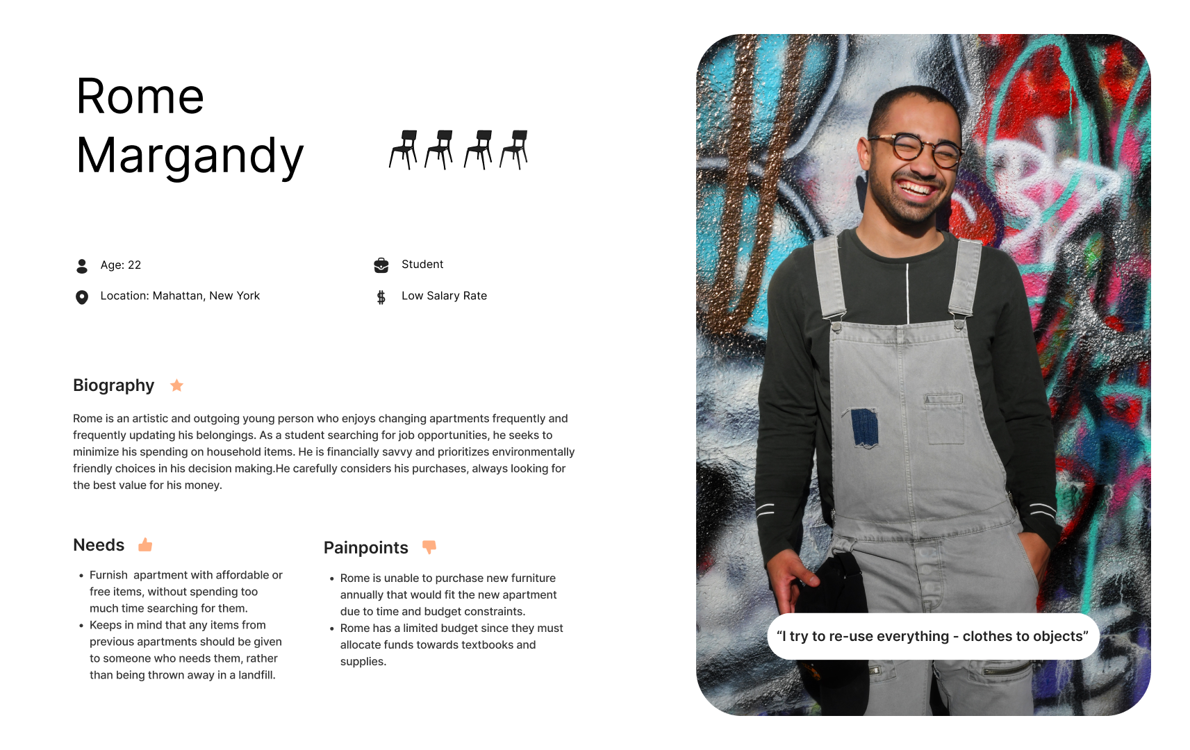
Enthusiasts like to follow Instagram pages but often don't end up going out to get the things they see because they lack real-time information.
Enthusiasts would like to know if there's anything nearby when they're already on the go.
There's a certain entertainment factor to this. Users enjoy seeing other people's success and imagining what they could have potentially experienced themselves.


OPPORTUNITY STUDY
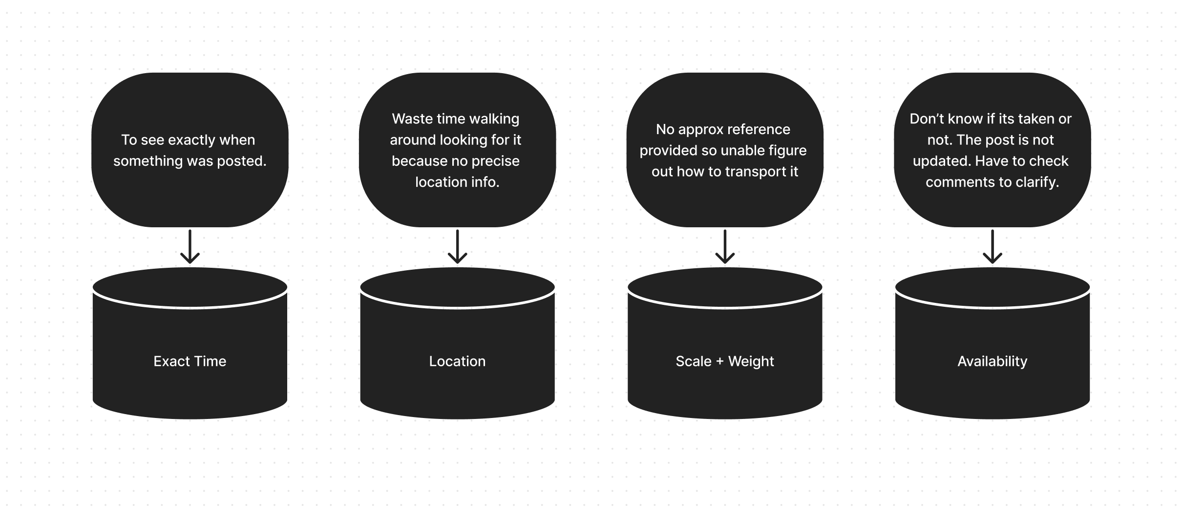
After creating a frustration map based on insights from user interviews and surveys, it became clear what the gap in the market was. This helped to define the opportunities.
OPPORTUNITY STUDY
After creating a frustration map based on insights from user interviews and surveys, it became clear what the gap in the market was. This helped to define the opportunities.
After creating a frustration map based on insights from user interviews and surveys, it became clear what the gap in the market was. This helped to define the opportunities.


INFORMATION ARCHITECTURE
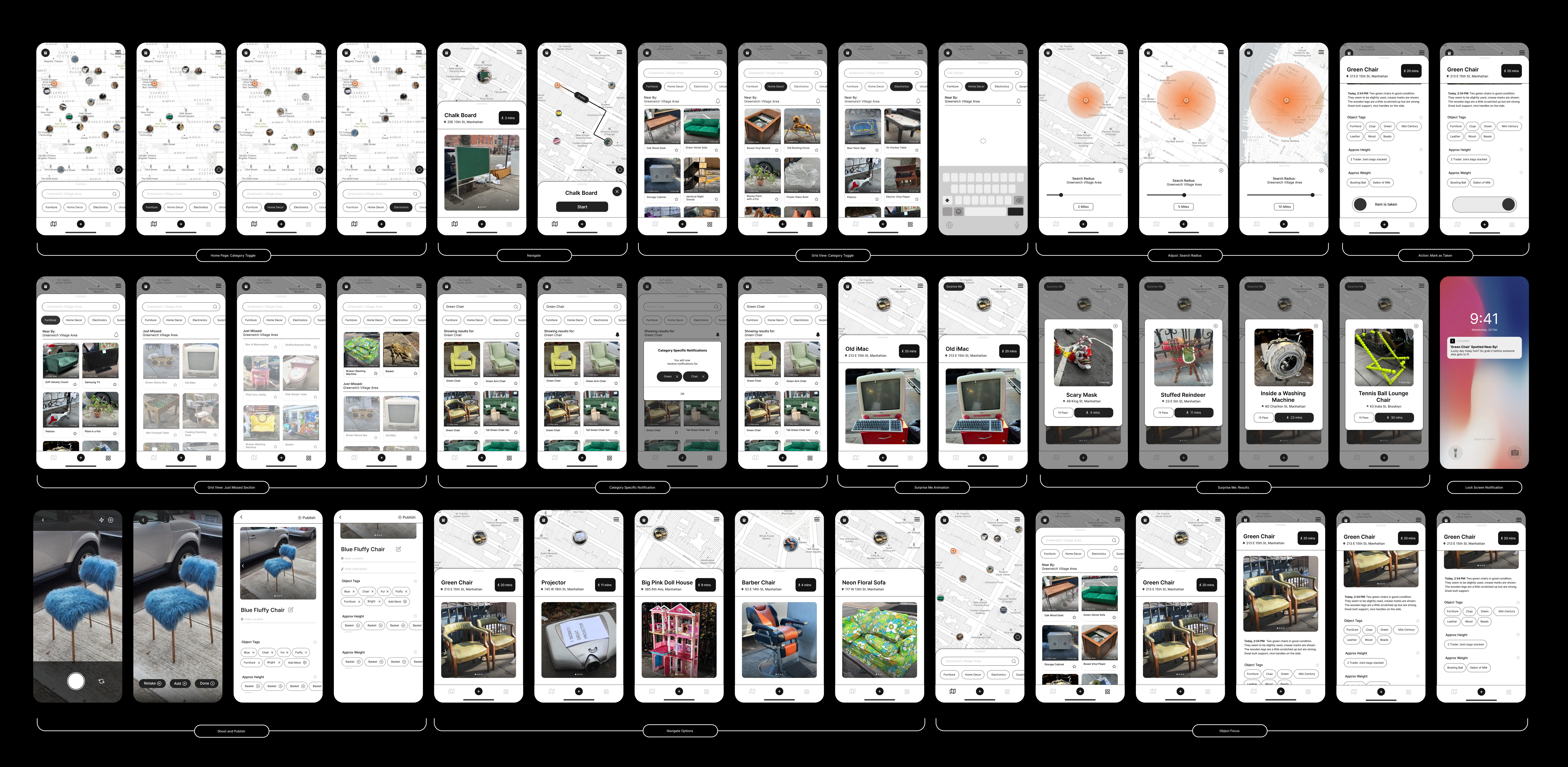
To ensure that the app is both enjoyable and easy to use, we planned the onboarding experience and posting process to be engaging and youthful, while also being efficient and effective.

PAIN POINT FOCUS 1
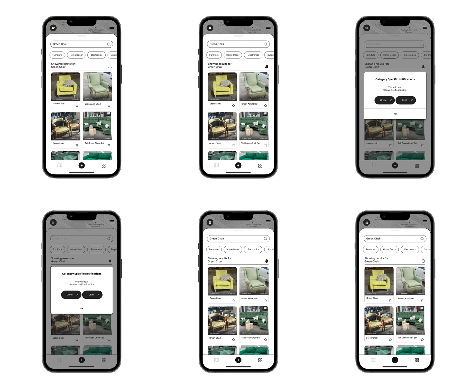
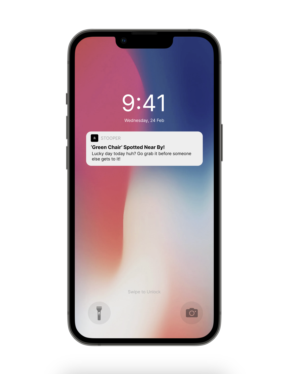
Another issue with existing platforms was the lack of searchability. With Stooper, we wondered: what if users could receive specific notifications for categories such as 'green', 'chair', or 'green chair'?
Users also wanted to receive notifications of interesting finds nearby while they were out and about. Therefore, location-based notifications were added to let them know quickly if there was something nearby to check out.
![]()
PAIN POINT FOCUS 2
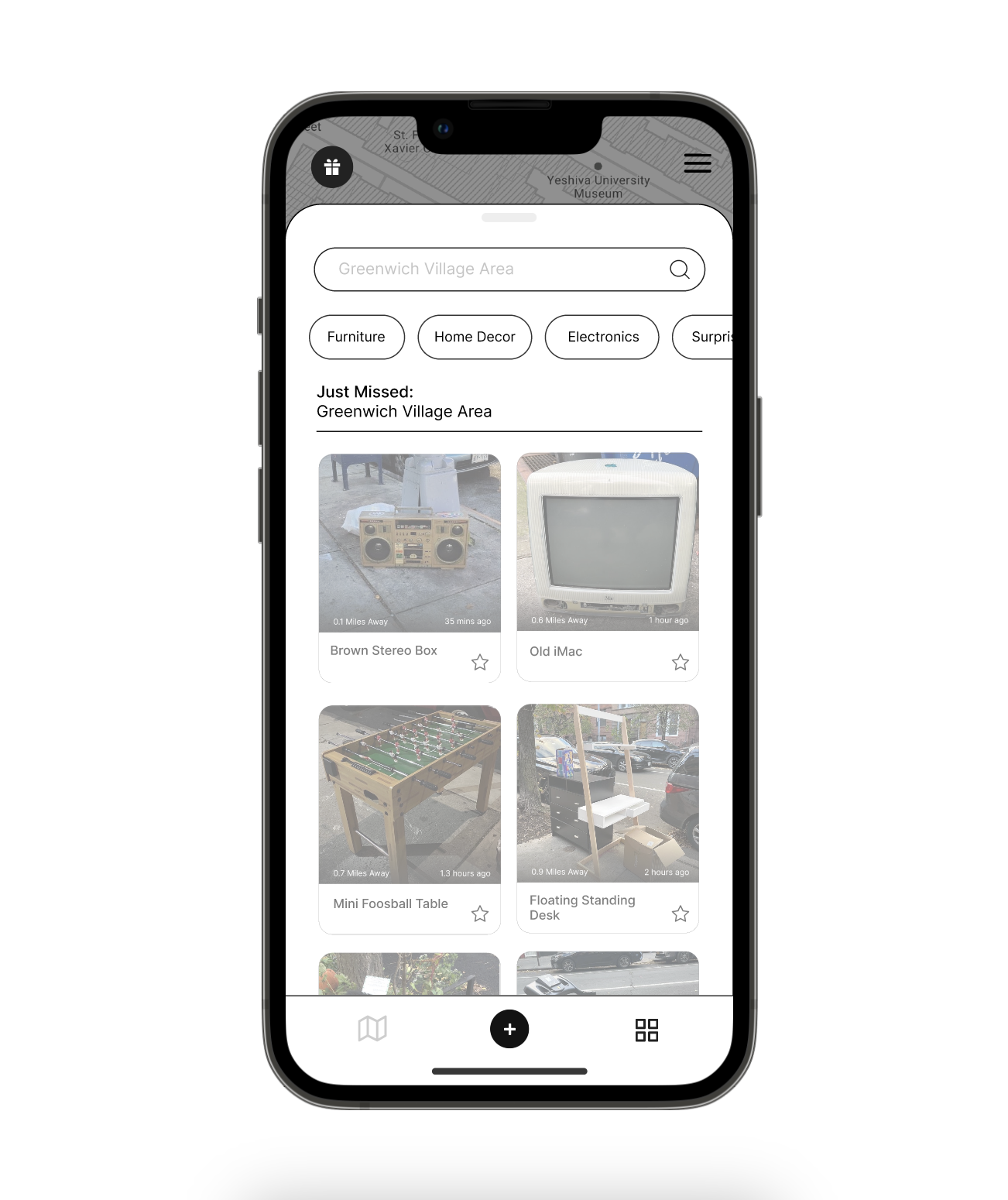
Existing platforms such as Instagram pages and Facebook Marketplace listings do not have a way to accurately view the time an object was posted, making it difficult to judge if the object is still available. Additionally, location descriptions are often vague and not geotagged, providing only approximate information.
This requires users to privately reach out to the other users to gather additional details. My real-time, location-based posting experience eliminates these challenges and provides an accurate method for gauging location.
![]()
Existing platforms such as Instagram pages and Facebook Marketplace listings do not have a way to accurately view the time an object was posted, making it difficult to judge if the object is still available. Additionally, location descriptions are often vague and not geotagged, providing only approximate information.
This requires users to privately reach out to the other users to gather additional details. My real-time, location-based posting experience eliminates these challenges and provides an accurate method for gauging location.


PAIN POINT FOCUS 3
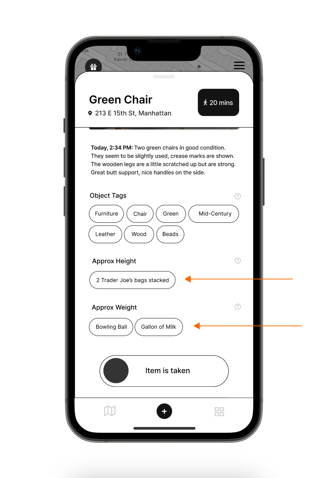
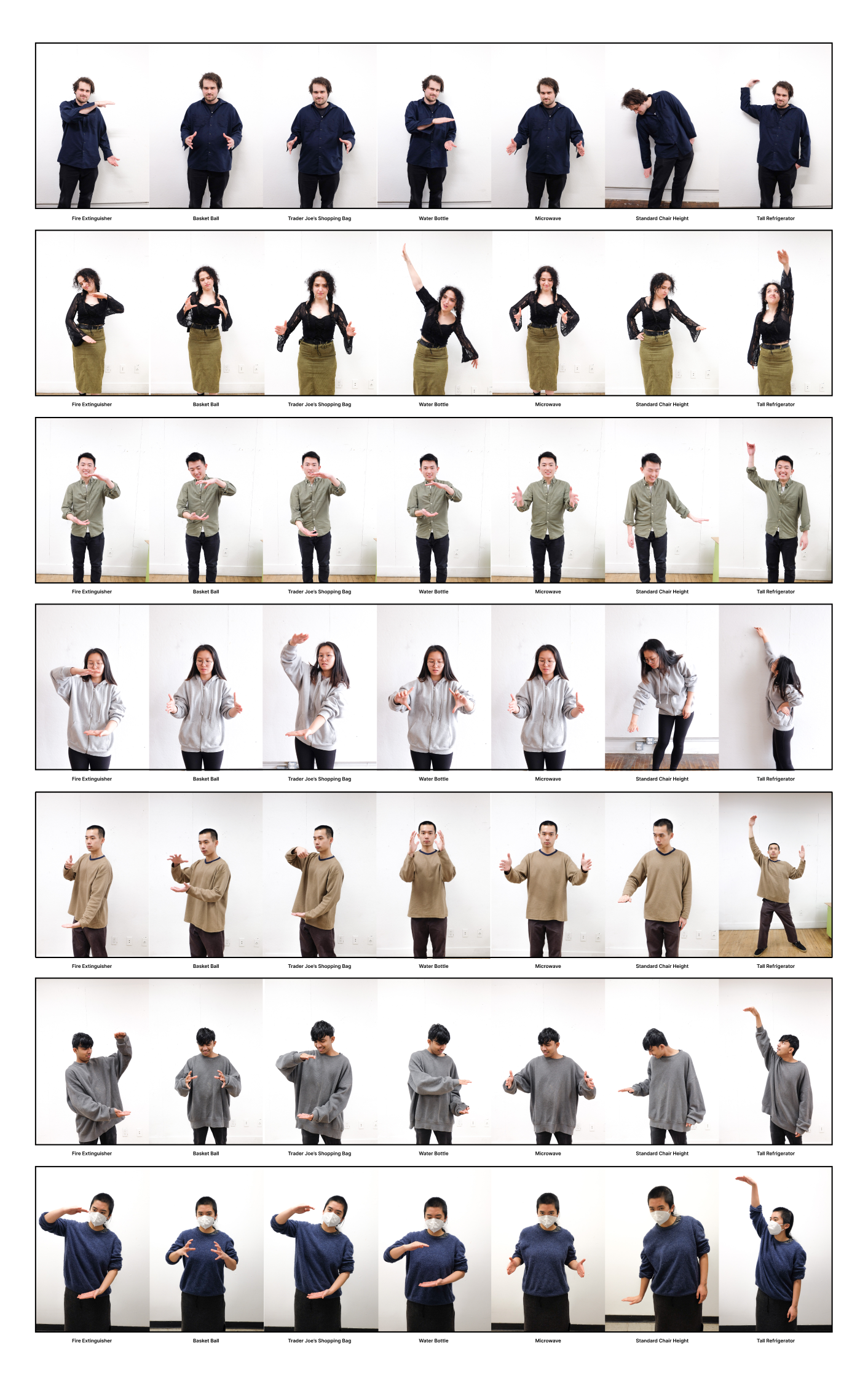
One of our main issues was how to convey the dimensions and weight of an object through a shared image without using actual numbers.
To solve this, I used ethnographic research methodologies and references that are common and easy to visualize, such as city-specific landmarks and everyday objects. Phrases like "as wide as a microwave", "as tall as a refrigerator", and "as heavy as a gallon of milk" helped people understand scale and weight more easily than numbers.
![]()
One of our main issues was how to convey the dimensions and weight of an object through a shared image without using actual numbers.
To solve this, I used ethnographic research methodologies and references that are common and easy to visualize, such as city-specific landmarks and everyday objects. Phrases like "as wide as a microwave", "as tall as a refrigerator", and "as heavy as a gallon of milk" helped people understand scale and weight more easily than numbers.

NEXT STEPS
Find a balance between strict rules and fool proof user experience to allow community rules to govern platform etiquette.
Integrate revolutionary technologies like machine learning and AI to enable image detection and automatic self-description for effortless posting.
Place greater emphasis on location data privacy.
Integrate revolutionary technologies like machine learning and AI to enable image detection and automatic self-description for effortless posting.
Place greater emphasis on location data privacy.

Team Member:
Krithi Nalla, UX Researcher
Project Timeline:
8 weeks
Krithi Nalla, UX Researcher
Project Timeline:
8 weeks
Email for Full Project Case Study
